Work In Progress: Suwanee River, Update 3
Last time I posed a number of questions to myself concerning this painting that I felt were important for me to answer. I’m hoping that, by answering them I can produce a better and more meaningful painting. So, here goes…
- What does this scene mean to me? What am I feeling that I want to convey to viewers?
This first question I posed to myself last time I answered then. I still feel the same, so I’ll go with that same answer again.
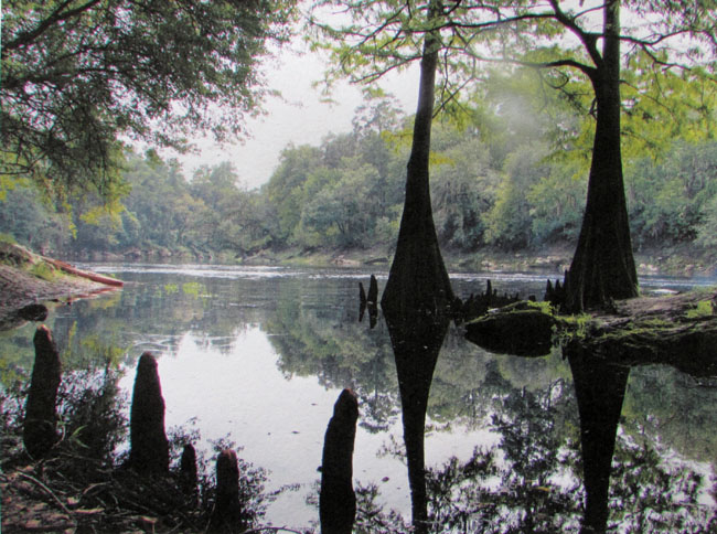
I’m standing in the shade, looking out into a warm, sunny morning on a peaceful, slow moving river. Overhead, the canopy of bald cypress and oaks, and a gentle breeze cools me. Beyond the shade, out in the open, the sun is still low in the sky, but it is warming the trees on the far bank of the river, resulting in a play of contrasting lights and darks.
- Should there be dramatic contrasts of lights and darks?
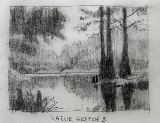
Dramatic lights and darks always make for an interesting painting. I’m standing in the shade of tree canopy, so the overhead limbs and the cypress trees on the right are dark and contrast with the sunlit trees out in the open.
- Should the trees be backlighted or should the sun be coming from the side?
The sun will be above the trees and to the left. That is the actual situation and I feel there is no reason for me to change it. Backlighting can be very effective and beautiful but I don’t want to change everything about this scene to make it something completely different.
- The color of the sky, as well as the reflection in the water is light near the
trees and darkens with height. The sky can be warmed with a very light peach in the lighter areas.
I’ve thought this one out and like the idea of the sun lower in the sky, causing the low sky to be lighter while the overhead sky will be darker blue. Adding a little peach to the sky will warm it a bit.
- A center of interest or focus? A lone bird or two in the distance? A kayaker?
I’m not sure yet what will be the center of interest. It will, however, be in the area near the water surface on the left side. The tree line on both sides of the river dips with distance and perspective, converging in the area of special interest. There is a very light horizontal line of sky reflection just below the river bank, so that will also help to direct interest to that area. I may enhance that reflection to strengthen the focal area. Whether I will add a specific focal point of interest, I haven’t decided yet.
- Time is late morning. The sun is still low in the sky and warming the tops of the trees on the far bank.
I discussed this some in #4. This will be morning, the sun is still low in the sky and the it is hitting the upper portions of the trees, giving them a warm glow.
- Clouds?
No clouds. I think they would just unnecessarily complicate the painting. They aren’t important to the messaqge.
- Keep the linear, horizontal line of white reflection from the sky. Maybe add a few minor streaks here and there below it. It makes a nice focus. It could also be used as an arrow leading the eye to a center of interest.
I’ve also discussed this earlier. The white reflection is a nice tool to use to direct attention.
- Where do I concentrate detail? What is important to convey the message and what only complicates and blurs the message? Thought needs to go into what is important to tell the story. What is necessary to support the message and what is not necessary? How much detail is necessary to convey my idea and when does it become distracting. I don’t want an abstraction but I also don’t want too much detail.
Detail will be concentrated around the center of interest. Detail will decrease away from the center of interest.
- The converging diagonals of the tree line, the white reflection and the upward pointing cypress knees help to present the center of interest.
Again, already discussed. They are strong tools to help direct attention.
- Use an underpainting of warm colors to emphasize the warmth of the light and to make the greens more interesting.
I will be doing an underpainting to introduce warm colors in sunlit areas and dark, cool colors in the shadows. These colors will be fixed to the paper by using an alcohol wash. Over the top of the underpainting colors I’ll use the colors seen in the photo reference. Hopefully, the underpainting will help to add interest and support for the final colors.
- Do I add complementary colors to the underpainting?
I’m not going to do too much with complementary colors for an underpainting. Use cool blues in the shadows. Where the shadows become lighter as they approach the sunlit areas I will add warmer blues (purples) to the mix.
- Add mid tone purples to the sky as an undertone?
Will probably not add purples or violets to the sky. This painting is not all about the sky, so I’ll keep the sky simple.
With these thoughts and guidelines in mind, I’ll start on the painting. If I haven’t already mentioned it, I’m going to do this one in pastel. Size is 14 X 19 inches on Pastelmat. The underpainting will be done with soft pastels and the finish painting primarily with pastel pencil. I’m wondering how well suited the pastel pencils will be to doing the landscape painting. Will I eventually switch over to soft pastels? This will be one test.