Work in Progress: Ruby Beach, Olympic National Park, Update 3
I came up with 3 more possible compositions – for a total of 8 for this painting. There may be more possibilities but I’m satisfied with these 8.
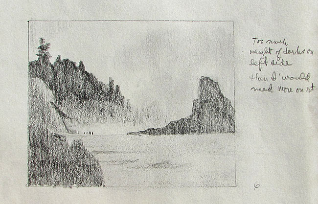
Composition 6, a horizontal format, keeps the group of people at the lower left but adds a dark mass to the lower left corner. I thought it might help to frame the people on the beach, adding to the darks to the left and top of them. However, it adds to much dark to one side, I think, and is out of balance. It would necessitate another dark mass on the right and I think that would be too much dark mass. It would also decrease the amount of light mass at the bottom, which is balancing the light tone of the sky.
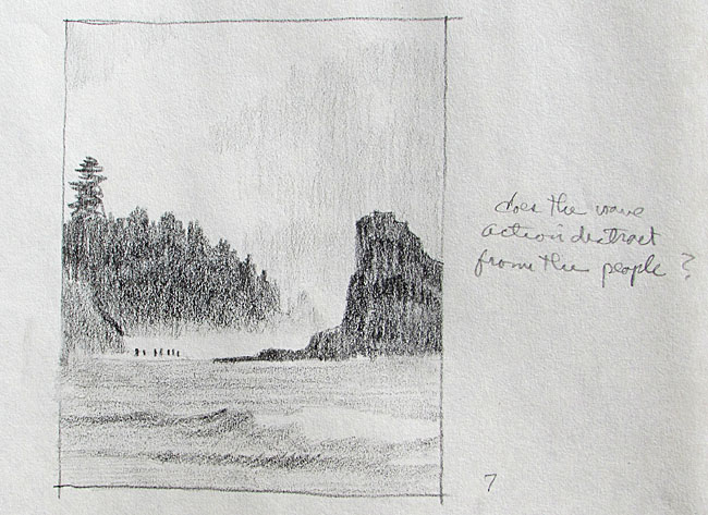
I went back to a vertical format for Compositions 7 and 8. In Composition 7 I stuck wit more wave action, a breaking wave on the lower right and a slightly lower rock mass on the right. I like this composition but wondered if the breaking wave competed with the group of people. Maybe not.
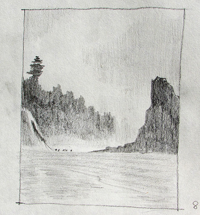
In Composition 8 I decreased the wave action by bringing the beach closer to the last of the waves rolling up onto the beach. The lower part is residual water, fairly still and reflecting the sky, the rocks and the tree masses. I also raised the height of the rock mass on the right, which seems to have emphasized the vertical feeling of the painting.
So, which one of these compositions seems the best? Which one am I drawn to? The 3 I like the most are numbers 3, 4, 7 and 8, two horizontal and 2 vertical formats. I have to say I like the horizontal formats more. The vertical formats, I think, emphasize the people because the group of people take up nearly a third of the width of the picture. The sky and clouds also play a bigger part. The horizontal formats emphasize the scenery, the expanse of the beach, the tree masses and rock. I’m drawn more to the scene. The people are seen nearly first in the vertical format while the scenery is seen first in the horizontal format. However the construction of the rock masses pointing to the people on the beach, as well as the white mist behind them draws the eye to them. “Oh, what a beautiful scene. Hey, look, there’s some people on the beach!” That’s what I hope I’m creating here. I’m leaning toward Compositions 3 and 4.
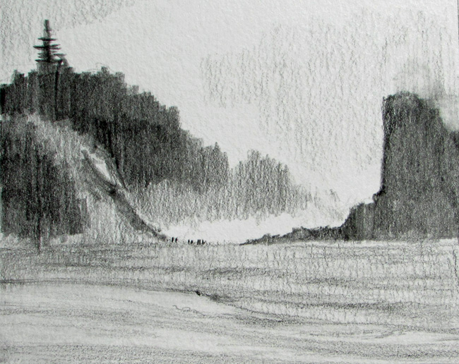
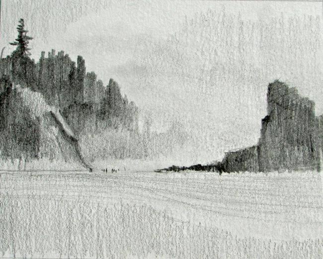
In Composition 3 the rock mass on the right is larger than in Composition 8. There is more wave action also. There is much wet sand in Composition 4, especially on the left side. The thin layer of water reflects the sky and rock masses and, I think, creating some balance. I like the slightly lower rock mass in Composition 4. The lines of the waves rolling in as well as the edge of the surf points toward the beach combers, helping to draw the eye in that direction.
My composition choice is either 3 or 4 and I’ll have to do some more ruminating. I’ll make that choice this week and then start on the color studies. Meanwhile I’m finishing up a graphite drawing for exhibit and post that next week as well.