Work In Progress: Glade Creek Grist Mill, Update 9
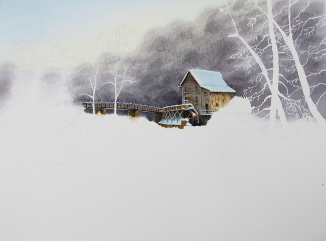
Painting the Mill is definitely the most interesting part of the project so far. It’s the focus of all the work. It’s the focal point of the painting – the main reason for the painting. It’s the subject that will have the greatest detail and – I hope – attention. The final photo in last week’s Update showed the penciled in Mill. Before painting the building I re-drew the Mill and bridge in detail because the Mill is the focus of the painting. A detailed drawing will make the painting much easier.
After adding another layer of the gray mix under the race I started on the Mill. First I layed down an undercoat to get a basic color for the Mill. Here, I mixed yellow ochre, burnt sienna, raw umber and burnt umber, made a light, watery tint and put down an undercoat. Once dry, I drybrushed in varying combinations of the same colors over the outside surface of the Mill to indicate aging and weathered wood. The wood on the Mill, depending on its exposure to the elements, over time turns from the rich reddish brown color to silver gray. It doesn’t all turn color at the same time, so after years of weathering, there is a wonderful mix of reddish browns, yellow browns and silver gray, spots and stippling, streaks and smudges. This is what I try to imitate with drybrush and wet in wet techniques.
After adding the color I used a small pointed round brush and a darker mix of the browns mentioned above to line in the horizontal siding on the left end of the Mill. Rather than make all the lines uniform (which would be dull) I made them irregular and skipped a bit, indicating rough, uneven surfaces and edges. I kept the upper edge of the line straight but made the lower edge irregular to indicate rough shadows. I also did not use a straight edge but did them freehand, adding more interest to them.
Next, the windows and doors were painted in. I used the same mixes and brush to paint the window and door trim in. To indicate depth, I used a darker color to line in the shadowed parts. When all of the outside parts were finished, I put in the dark window panes and doorways and shading under the eaves of the roof and under the window sills. For that a mix of winsor blue and burnt sienna gave a nice dark, near black, color. It was necessary to use a magnifying glass to paint in the window panes, leaving the mullions visible.
Although the back half of the left side and the back of the Mill have board and batten siding, indicating them with paint entails the same process as with the horizontal siding. I used the same color mixes to indicate weathered wood.
Once the siding was pretty much finished, I put a glaze of the gray mix over the shaded side of the Mill. At that point I wasn’t sure how much to darken it, so I left it at that. I could revisit the shading later. I didn’t want to go too dark right away because I needed the Mill sides to be easily differentiated from the background.
The water race was next. There, again, I used the same brown mixes to put in the sides and their bracing boards. After working the race, I painted in the lower, stone base, of the Mill.
After stepping away from the painting for a day I went back to look at the shading and decided another coat was in order. There wasn’t enough difference between the sunlit and shaded sides of the Mill. But if I did that I’d also have to darken the background behind the Mill and Bridge. So, I did both. This time I added another glaze on the shaded side of the Mill with Paynes grey, keeping the shading to the blue side. Adding the glaze loosened the underlying paint, so I had to go back over the detail again, after it was dry.
The supports and water wheel were next in line. The brown mix was used for the supports. Here I made sure, as with the other boards, to indicate the light and shadowed sides. The water wheel is a different color, however. There’s a bit more red in it. For that I uses a combination of permanent rose and burnt umber. (You may be wondering how I can see all this detail in the photo, and I don’t blame you. The truth is, I did some research online and came up more photos of the Mill. This helped greatly. I was able to see more of the siding, the water race supports and the stone bridge supports. All this adds to the richness of the Mill). I was careful to work around the snow on the race, the fence and the water wheel. (Not real careful because I did use white gouache where needed to bring out the white snow where necessary).
The bridge is an important part of the painting. The combination of dark and white lines help lead the eye to the Mill. I painted in the posts and railings with a mix of burnt umber and winsor blue, using a straightedge. This is where carefully drawing in the structure beforehand pays off. You can easily make a mistake with the spacing and it will show up later. I was careful to leave in the white of the snow on the railings but did use gouache white on the post tops.
A further glaze of the gray mix was added to deepen the shadows on the wheel and the lower part of the Mill, as well as under the platform near the door on the right side.
Lastly, I painted in the stone supports holding up the bridge. Burnt sienna, burnt umber, raw umber, some new gamboge made for some nice browns. I dabbed them in to indicate stones and added shading to define edges. Also used the same mix to paint in the low stone wall below the supports to the Mill race.
Just to see how the building would look I started adding some snow near the Mill. Though not completely finished I put in enough to suggest the snow on the roof, the race, the bridge, window ledges, signs and under the race. Here I used winsor blue and added some indigo blue in the shadows.
From here I’ll begin to work my way forward, painting in the frozen waterfalls, the stream banks, shrubs and trees.