As I do with every painting, I’m going to go through the planning and thinking stages as well as the painting stages. I find it very worthwhile doing this each time I create a painting. It keeps me from rushing into the painting process before I think through the composition. No matter the subject, whether it’s building a piece of furniture or teaching a class or designing a garden, taking a vacation, or painting a picture, I find researching it out beforehand enables me to do a better job. The research I did on snow made me realize how much more there is to snow than just white.
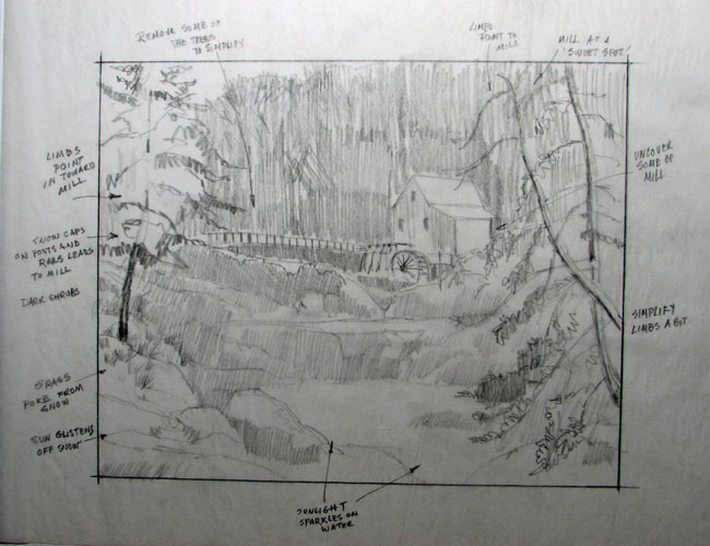
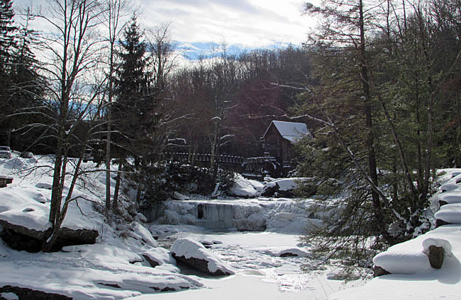
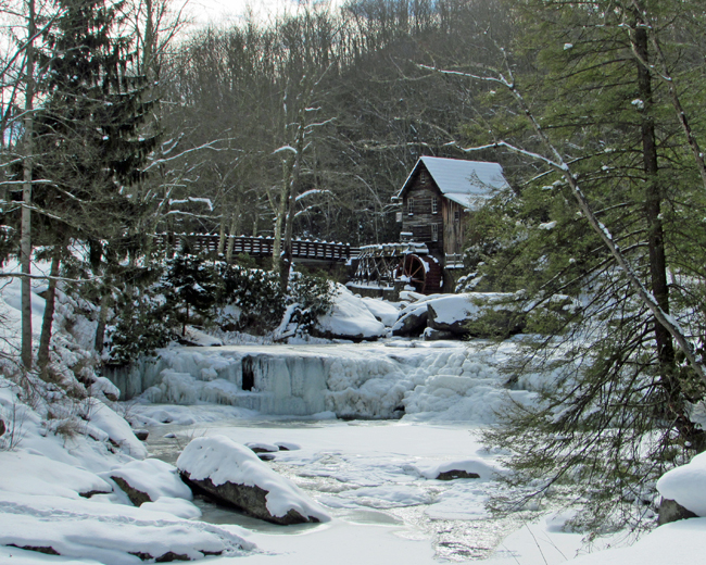
The first thing to think about when you’re contemplating a painting is “what is the subject?” What’s this painting all about? Deciding on the subject helps with the composition. In this case the subject is the mill – Glades Creek Grist Mill. That’s what I want viewers to focus in on. Everything I do in composing the scene after making that decision has to help focus attention on the mill. You, of course, want viewers to look around the painting, see the other things you’ve done, but you want them to be led to the mill as a focus or center of interest. I took a lot of photos of the mill and its surroundings and had a hard time narrowing the scene down to one photo that “says it all”. That’s where artistic license come in. Changing this a bit, adding something, removing something else. It’s rare that a photo has everything you want.
First of all, how do we create a center of interest. There are a number of ways of doing it but they all come down to contrast. Contrast draws the eye. It’s something very different from its surroundings. The contrast can be color or shape, hard or rough edges, small marks or value. Value is probably the best and most important way of creating contrast. And, although contrast is the most important means of isolating the center of interest, the other methods should be employed as well whenever they can be worked in.
In the case of the Mill, the white roof, covered with snow, naturally, even without further development, stands out from the darker background. That’s a good start. The trees behind the mill contrast sharply with the Mill’s roof. The Mill’s wood siding is very dark on the left side, and that’s good. And if I added a bit of brown, maybe with reddish highlights, the color and value would contrast with its surroundings. The darker color of the Mill also contrasts with the snow beneath it. I like the bridge leading over to the Mill. It serves an important purpose which I’ll go into in a moment. The fact that it, too stands out from the background because of the dark shrubs behind it and the snow capped posts is a happy coincidence.
Placement of the center of interest within the picture is important. If it’s placed too close to the outside, the viewer’s eyes may find it too easy to wander off the picture before exploring all there is to see. The rule of thirds becomes very important here. If the picture area is divided into thirds both horizontally and vertically, the center of interest is best placed, and will be most noticeable near the intersection of the dividing lines. That gives us four spots to place the Mill. I purposely cropped the photo in four different ways to see which looked better. The one I chose places the Mill in the upper right intersection. That way we get to see a lot of the snow, the bridge leading to the Mill is effective, and not too much sky is shown. We wind up with a lot of variety.
The other reason the bridge is important is that it helps to lead the eye to the Mill. After making the center of interest stand out from its surroundings, there are things we can do to lead the eye to it. One is the bridge. It’s a line of white dots and lines pointing to the Mill. Maybe all we have to do is strengthen it a bit by removing a few trees in front of it. I’ll have to see how that works when I work up some sketches. The trees on the right and left prevent the viewers eye from passing out of the picture. I’m just not sure of the one on the left. Is it too dark and distracting? Trying out some sketches will help.
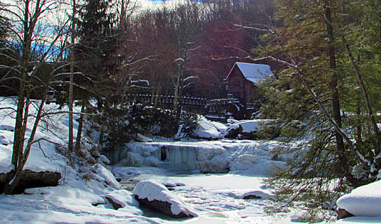
The last thing I want to discuss (so I don’t make this too labored and boring) is the orientation of the painting. Vertical or horizontal? I tried both and preferred the horizontal. Vertical orientation, shown in photo 0296, doesn’t due justice to the surroundings, and the surroundings are important to the Mill. To get the full impact of the foreground waterfall you need width. The bridge also requires width. Although I want the Mill to be the center of interest, I want to show the beautiful surroundings. Horizontal does the best job. I did try a wider format, photos 0297Aa and 0297c, but then the landscape becomes a little too important and the Mill less. It was a tough choice. I did like the wider formats a lot. Maybe I’ll use them in a later painting. In the end, I stuck with a 1:1.25 format, shown in photo 0293c. The painting will be something near 30” wide and 24” high.
Next week I’ll present the composition, value and color sketches.