Work in Progress: Pelicans, Update 1
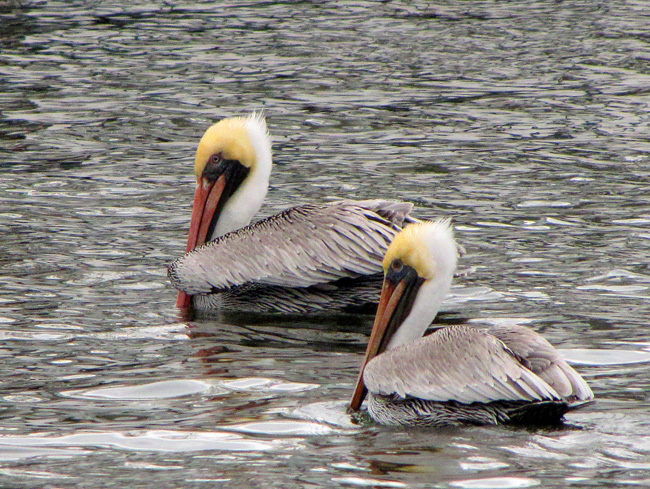
Pelicans are interesting birds. Their very distinctive beaks make them one of the most recognizable aquatic birds around. On recent trips to Tarpon Springs, Amelia Island and Canaveral National Seashore I found them to be one of the more ubiquitous birds on the water. They look so at home either gliding along the beach, just above the surf, or floating about in the harbor amongst boats. I managed to get some photos of them doing both. I liked the photo of a pair of brown pelicans casually paddling about Tarpon Springs harbor and felt the combination of the birds and the dancing colors and reflections on the surrounding water would make a nice painting. Its simple nature had a quieting effect on me and I wanted to convey that in the painting.
This will be a pastel painting and, because I want to do an underpainting in watercolor, I’m going to do this painting on Arches 300 lb watercolor paper. The roughness of the paper should allow for a number of layers of pastel. The size I’ve decided on is 16” by 12” high – a horizontal format.
The first task was to decide on a composition. I thought I might try three birds in the painting but after a few sketches I decided that two birds worked best. I liked the relationship of the two birds in the photo, one broadside and paddling right to left, and the other nearly facing away from me, paddling toward the first. This difference in poses added some interest.
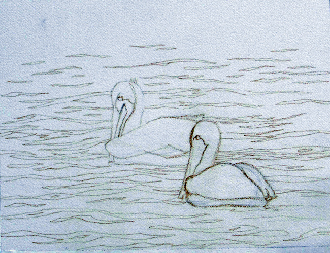
The multitude of reflections on the surface of the water seemed a bit too busy for me so I decided to reduce the complexity. I wanted some wave action but not quite as much as in the photo. This is to be a simple composition with only two elements – the birds and the water. Since the birds were the subject, I want them to be large enough to easily draw the viewer’s eye. The water would in a supporting role.
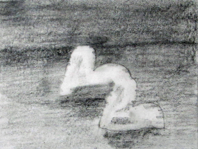
The next task was to work up some value sketches. The birds, with their white necks and yellow coloring on their heads, would be the highest values and make them stand out. The water would be a middle tone. Rather than have this mid tone go all the way to the top of the painting, I felt grading the tone gradually from mid to dark would balance better. I think the dark above also helps to draw more attention to the pelicans. Although the darkness is there, it does not draw attention away from the birds.
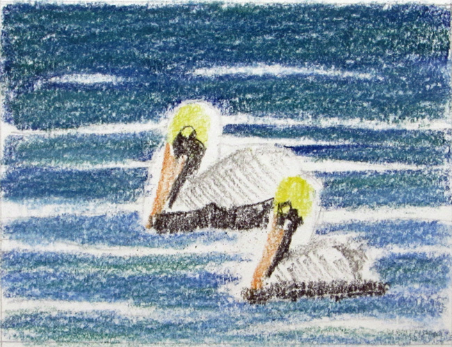
The last task in this preliminary stage is the color sketches. It is important that the values of the colors agree with the value sketch. As for color, the colors in the photos ranged from gray to blue. I wanted to steer away from gray, so I tried one sketch with blue. The color seemed to compete with the birds. In a second color sketch I added more greens into the mix and reduced the blue. The water became more neutral. I liked that better.
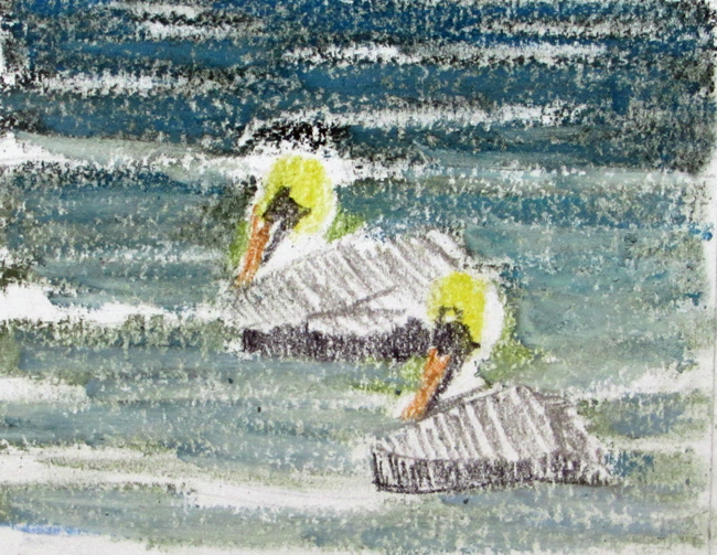
With the compositional, value and color sketches done I am now ready to start the finished painting.