Work In Progress: Suwanee River, Update 5
As with most pastel landscape paintings I decided to do an underpainting.
But, just what is underpainting and why do we do it? This is a question I kept asking myself as I watched many fine pastel artists demonstrate. They all pretty much used the technique of underpainting and I couldn’t grasp the purpose. Sometimes I would see a big difference in the final painting and other times I was at a loss to see a big change. So, in my usual modus operandi, I did some research. If I was going to do an underpainting, I wanted to understand why doing so would make my paintings better. Many of you already know the reasons for underpainting, but for those who are unfamiliar with the technique or are still trying to grasp the reasons for doing an underpainting, read on.
So, what is an underpainting, as it applies to pastel painting? Underpainting is applying a layer of color or gray-tone medium on a support or surface and then painting over it with pastel. The under painting can be almost any medium – pastel, watercolor, charcoal, acrylic, oil paint, gouache, ink, graphite. If it is a liquid or semi liquid medium, it is usually thinned. If it is solid, such as pastel, graphite or charcoal, it is usually applied lightly.
What is the purpose of the underpainting? Sometimes it is used to develop the composition – to work out the shapes, masses and value relationships – to be sure that the structure of the painting is sound. We can also do this by producing value and notan sketches but establishing the structure on the full size painting works out any uncertainties that may not have been apparent in the value sketches.
Other reasons for doing an underpainting are to develop the mood and feeling of the painting and to provide a foundation to try other creative techniques.
The mood for the painting can be established through choice of color for the underpainting.
One important point to keep in mind is that, for the underpainting to work, it must be allowed to poke through the overpainting here and there. It is this combination, sitting in juxtaposition to one another that makes the painting work.
There are two basic ways to do an underpainting. One involves just priming the support with one or more colors, and the other is to produce a very loose painting similar to the final. Priming generally covers the support with a uniform color, although combinations of colors can be used, limited only by the imagination of the artist.
A very loose preliminary painting can also be undertaken as the underpainting. As I mentioned earlier, this method helps to work out compositional issues prior to the finished painting.
Whether priming or loose painting, choice of colors for the underpainting has a marked effect on the finished product. Many artists like to use neutral beige or mid tone colors or earth tones for priming while others use complementary or analogous colors, or a combination of them. Complementary colors can add excitement to the painting, as they peer through the overpainting. Analogous colors build harmony as they add support to the overlying color. Intensity of the colors used also greatly affect the results. High intensity underpainting colors left to show through here and there add much excitement to the painting. Alternatively, low intensity underpainting colors can add balance and unity to vibrant paintings.
Regardless of whether the underpainting is complementary or analogous, it is a good idea, when preparing the underpainting, to keep to the values established in the preliminary value sketches. Likewise, the overpainting should be the same values.
The underpainting can also be a monotone value painting done loosely or in great detail. Grisaille (pronounced greez-eye), used with transparent watercolors, is a fully finished value drawing done in shades of gray or other monotone color, over which transparent colors are glazed. Richard McKinley has used this technique many times by preparing an initial line drawing in pastel, including values, applying a clear gesso layer over the top to protect the drawing, then adding transparent watercolor and finally pastel on top. The pastel layer was done lightly in places to enhance and intensify the watercolor. Other choices for protecting the initial drawing are Art Spectrum Clear Pastel Primer and Golden Acrylic Ground for Pastel.
Underpaintings can be composed of pastel, done dry or made wet, or can be composed of mixed media. Dry pastel can be rubbed into the paper by various means but doesn’t become permanent and can be altered by later applications of pastel over it. More permanent applications result from wetting the pastel with mineral sprits, turpenoid or water, either with a synthetic hair brush or spray bottle. The pastel dries into the support and pastel can be applied over it without affecting the underlying layer.
Mixed media can also be used to produce the underpainting. As I mentioned at the top of this discussion watercolor, gouache and acrylic, gesso, ink, graphite and charcoal, and even thinned oil paints can be used. Even combinations of all these media are possible.
If you want more information, Jan Blencoe has a great discussion on Underpainting on her blog. I found her discussion and examples very informative and clear. The discussion can be found here:
thepoeticlandscape.com/2013/03/why-do-under-painting.html.
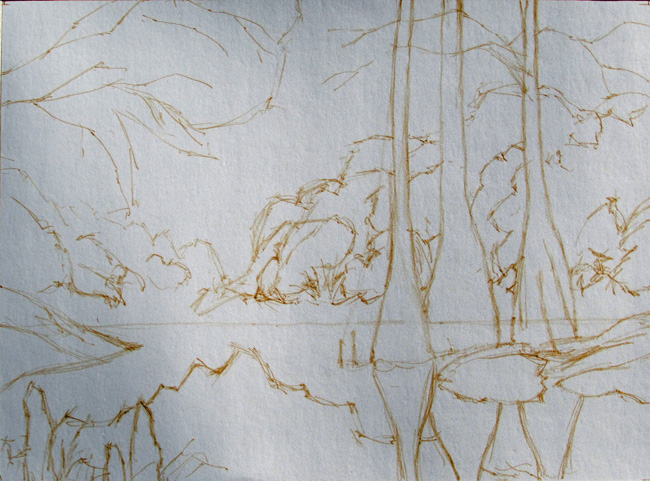
The first step was to roughly sketch the drawing onto the pastel paper. I did this with an ochre pastel pencil. The pastel paper is Pastelmat. The size of the painting is 14 X 19 inches. I taped off the picture area to keep a clean edge.
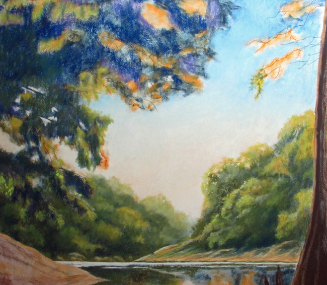
I chose to go a little conservative with the underpainting. I chose just a few colors to establish the darks and lights and help support the final overpainting. In order to add a bit of sparkle in the sunlit portions of the trees I used some orange yellows, both for the foliage and for the reflections. For the shadows I used dark blue. For the sky and the water reflections I used a light blue for the higher reaches of the sky and a lighter, creamy color for the horizon – where the sun, which is off to the left, was rising above the trees. The cypress trees, which are in shadow, are very dark, so I used a very dark brown and black.
All these colors were done lightly with the side of the soft pastel stick. You’ll notice that the painting was also done very loosely. I just wanted to get the basic structures in place, in the approximate value I wanted (based on the value sketch). The good thing about the pastel is that it is opaque and I can refine and adjust as I progress.
After applying the pastel, I went over it with a denatured alcohol and a synthetic bristle brush. Wetting it all down embeds the pastel into the paper and make the underpainting permanent. I could run my hand over the painting after it dried and no pastel would come off. Yet, there is still plenty of tooth on the paper to take the pastel.

After the underpainting dried I started applying soft pastel to the surface, covering the previous layer but allowing it to show through in places. The next photo shows the beginning stages of this work.
I’ll now continue to add pastel over the underpainting to develop the true painting.