Work In Progress: Hydrangea, Update 3
As in the last two paintings, completion of this painting will be done in a number of stages. The first three stages have already been accomplished – developing the composition, the tonal study and the color study. After transferring the drawing to the finish paper, the final four stages will be carried out to complete the painting. Those four stages are blocking in the shapes, developing the shapes, refining the shapes and final touches.
You’ll notice I describe progressing through the painting in terms of shapes – that’s what I have to keep in mind. Although this a floral painting – a painting of Hydrangea flowers, it is ultimately a painting of shapes – the arrangement of shapes of varying tones into a pleasing composition. For me, at least, it’s not always easy determining whether I have the best arrangement or a universally pleasing arrangement of shapes. I think it’s very subjective. What I’m comfortable with may not make you comfortable. But, that’s all we have. We put together shapes in varying configurations and of differing tonality according to generally accepted beliefs and choose the one that we feel best about – and hope that most others feel the same way. It’s a very personal journey.
Many pastel artists work their paintings from dark to mid tone to light, and that’s the way I worked this one. Working in this fashion can develop the three dimensionality of a shape – the mid tones are always in between the lights and darks, giving solidity to a form. However, another way of tackling a painting is to place the darks first, then the lights, then the mid tones. Establishing the two ends first allows you to develop the mid tones as needed to fit in. This way makes a lot of sense to me and I may try that in my next painting.
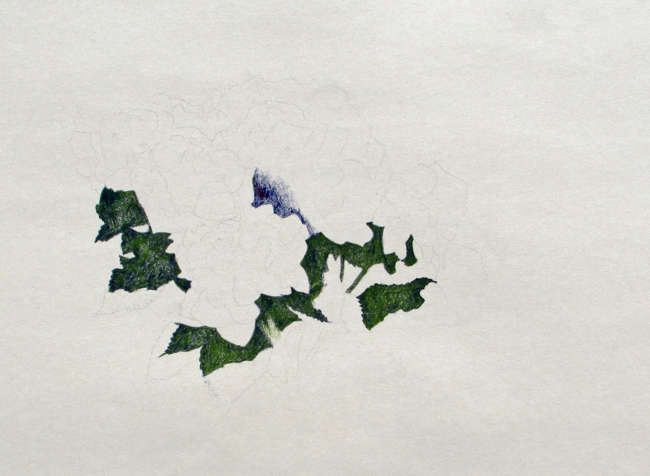
In this painting I placed in the darks first. For the first pass, or blocking in stage the shadow areas within the flowers established with CO 390. For the shadows with in the foliage I used a combination of CO 390 and PP 168. These colors seemed pretty close to what I observed when looking at Hydrangea flowers outside in my own garden. During this first pass I’m not using the darkest darks or lightest lights so that I can go darker or lighter if necessary to expand the range of tones. The dark blues somewhat frame the lighter shapes of the flowers.
The midtones came next . Here I used CO 440, 450 and PP 140 for the flowers and PP168 for the leaves.
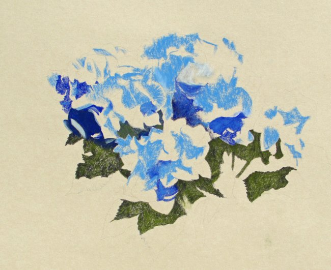
All the lighter areas of the flowers were layed in with CO 435. I didn’t go any lighter on the leaves at this point.
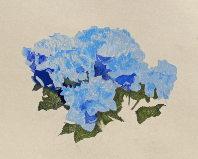
It wasn’t always easy but I tried to think in terms of large shapes when blocking in at this stage. Standing back away from the reference photos to eliminate details helped. I also squinted. At this stage I’m only interested in the most basic shapes and their tone in relation to one another. I had a tendency to start placing details, that’s why I had to consciously think only in terms large shapes, including only landmarks here and there to make it easier later to find things.
The next pass through will be development of the shapes.