Work In Progress: Hydrangea
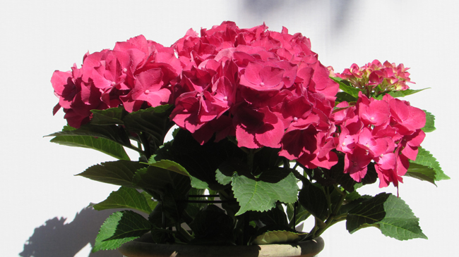
One of my favorite shrubs is the Hydrangea. They are simply gorgeous from late spring through early summer and provide color here in Florida right after the Azaleas finish blooming. They, along with Camellias and Azaleas, provide for a long season of color in the deep south that starts in late September or early October, and doesn’t end until late June or early July. Hydrangeas were a mainstay in the gardens of the estate where I worked for thirty years and they still are in my home garden. My wife and I see them wherever we travel in the south. Hydrangea colors range from white to blue to pink and near red, and it’s possible to find a mix of blue and pink flowers on the same plant – and even a color we call “blurple” – a mix of blue and red in various degrees.
My next project, needless to say, is a Hydrangea. Although we have quite a few growing in our gardens, I found inspiration in two potted plants we had on display. Although both were hot pink, I decided, for the painting, to change the color to blue.

I took a number of photos of each plant from different vantage points and drew a rough sketch of the view I thought best. When I completed the sketch I was unimpressed with the arrangement of light and dark masses.
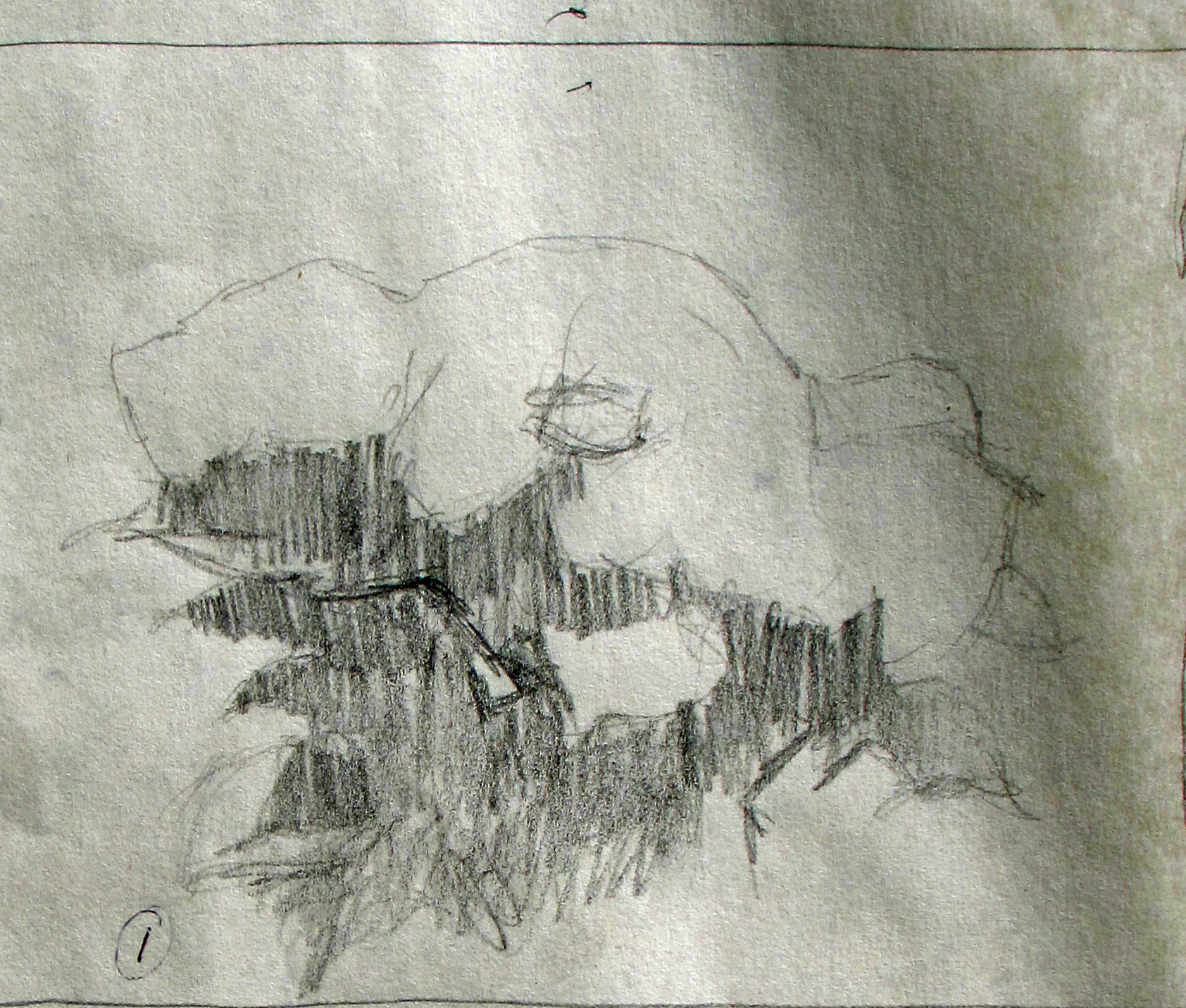
It was too static. As I looked through the images again, I was unable to find one that I really liked. The shapes of the floral masses weren’t interesting. They all presented a horizontally oriented grouping of light toned floral masses atop a dark mass of leaves. However, as I looked through the different images again, I was struck by two views that, when combined, presented an inverted “U”. If I combined the images, one of the arms of the “U” covered much of the dark foliage and, for me, the arrangement looked immediately better.
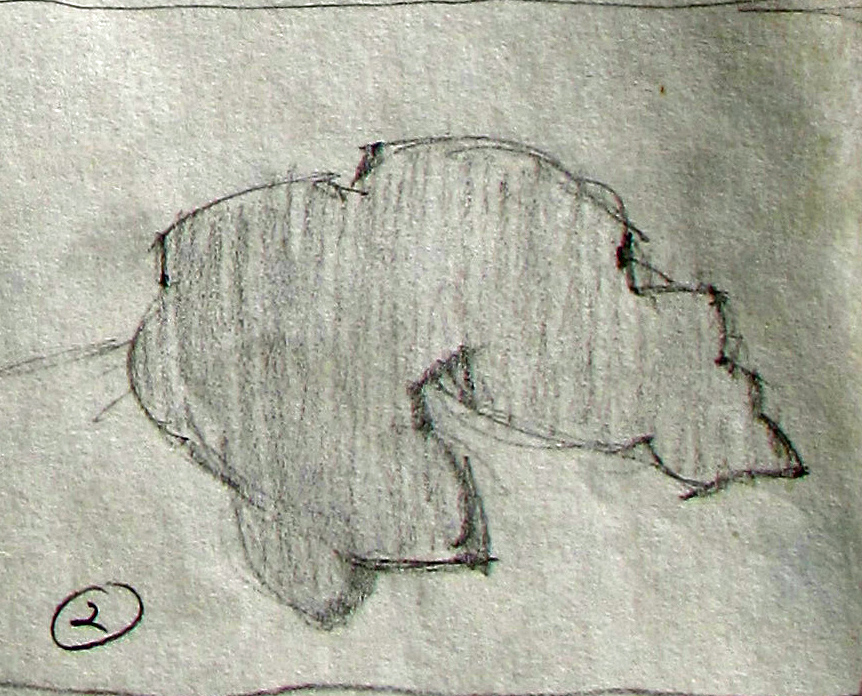
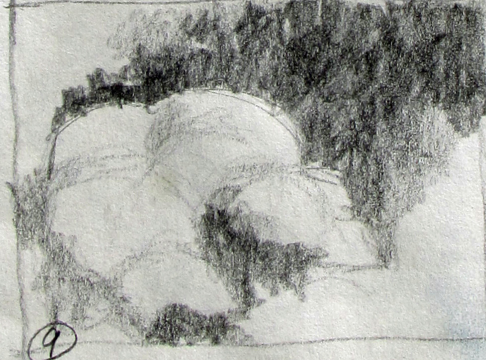
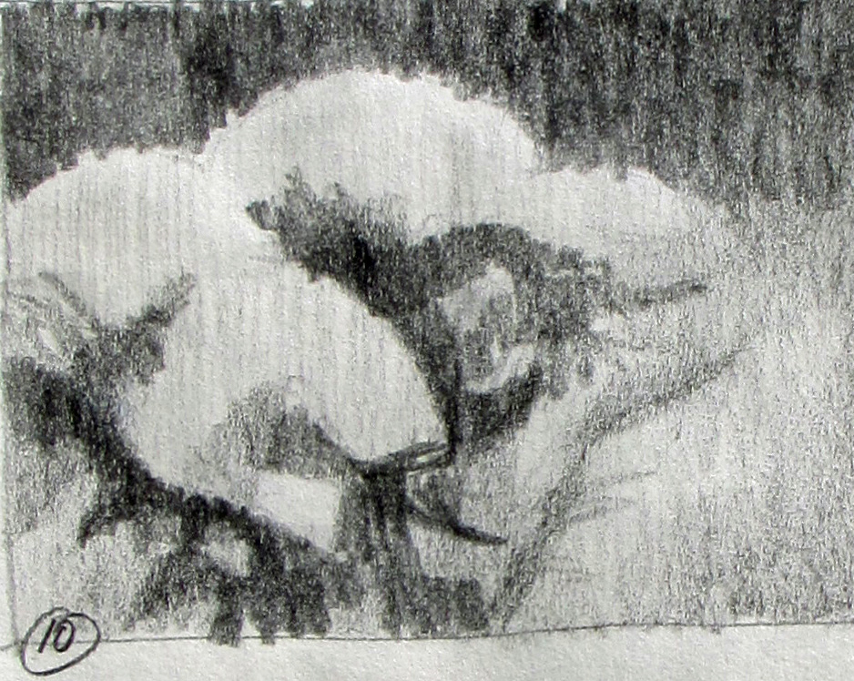
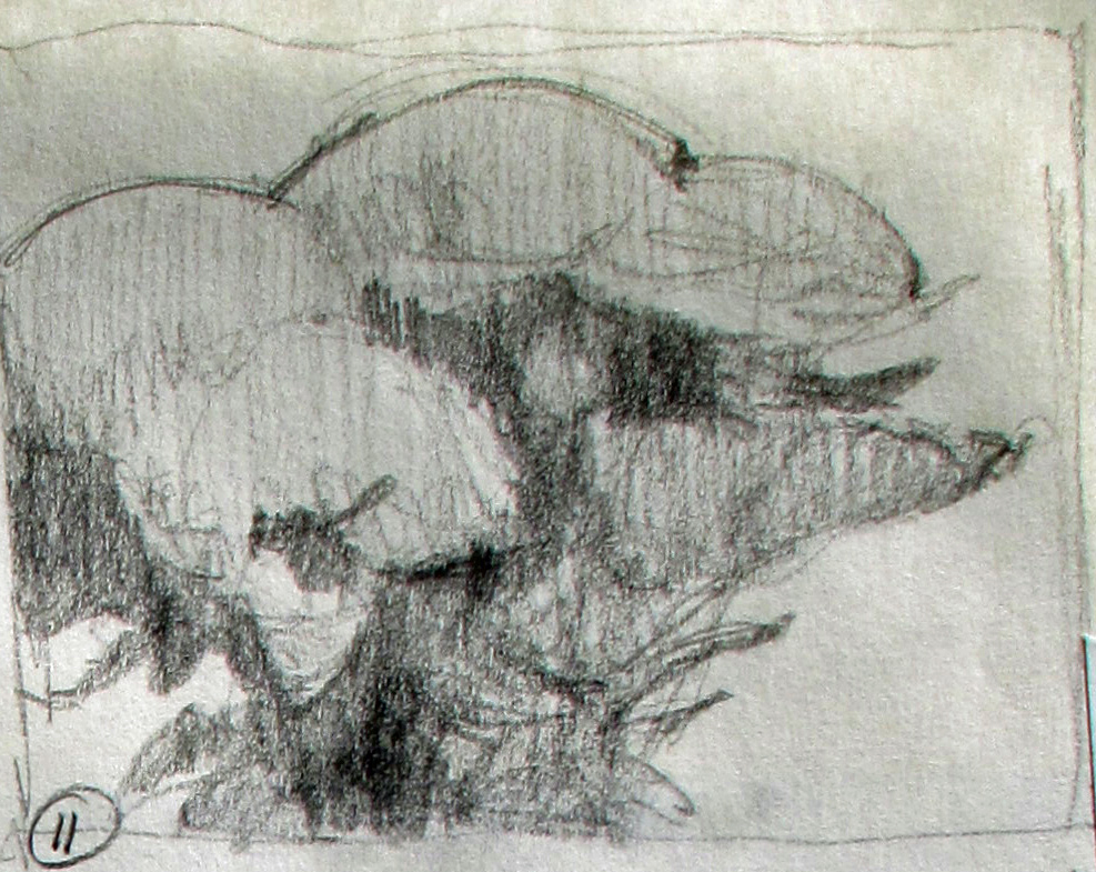
I decided to stick with this new arrangement and began to use it as a basis for a number of tonal studies. I wasn’t sure if I wanted to do a vignette or a full, border to border painting. After each tonal study I did a quick color study to see how the colors and masses fit together. All together, I did twelve tonal studies and seven color studies.
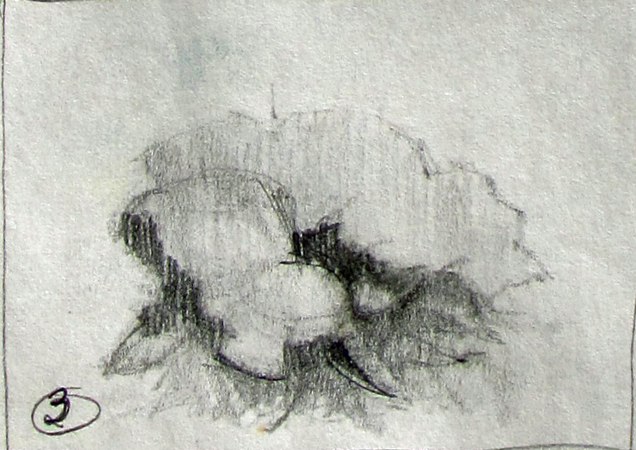

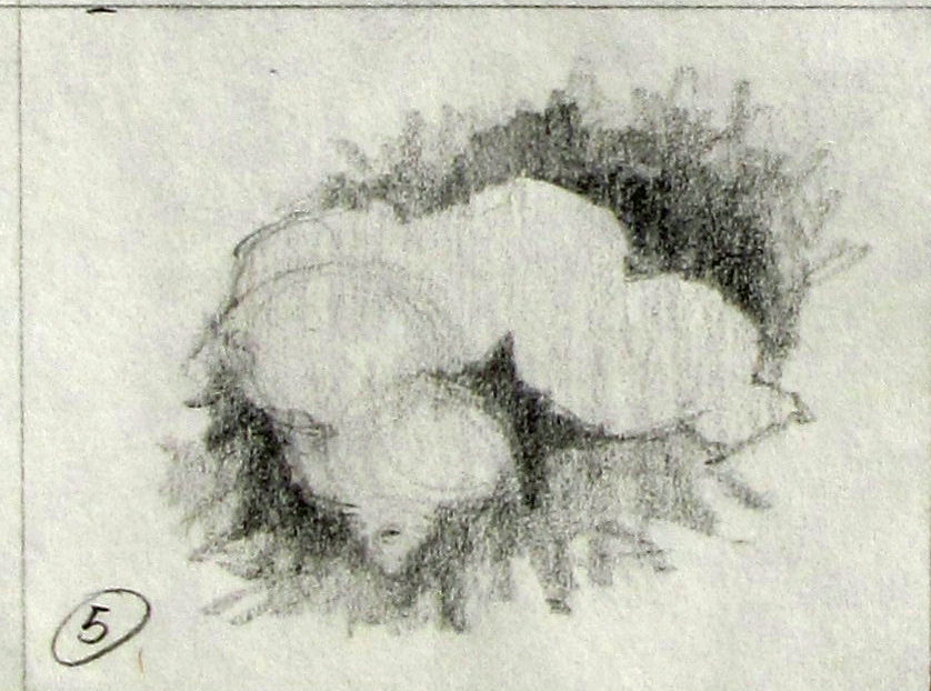
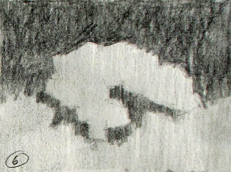
Here are the color studies:
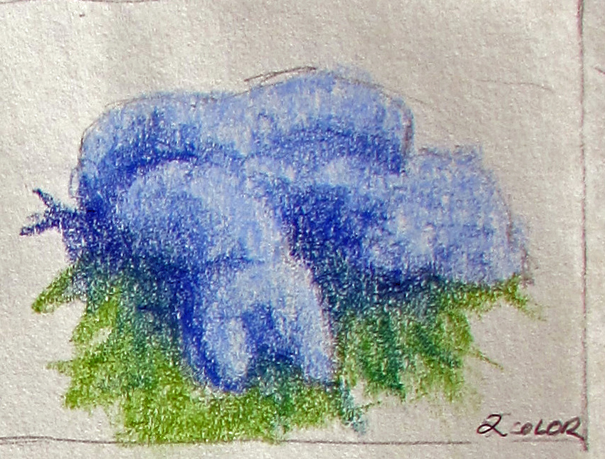
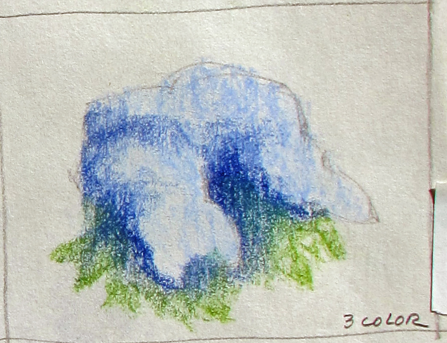
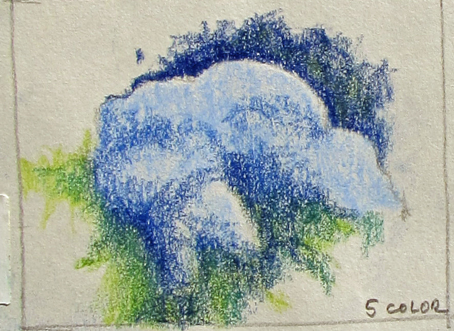

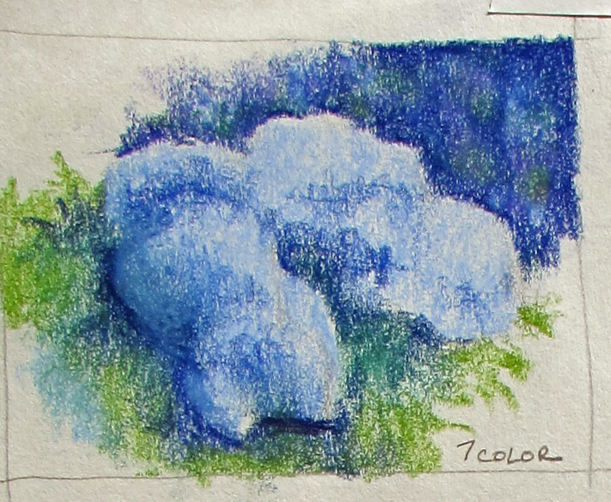
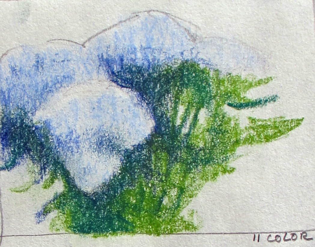
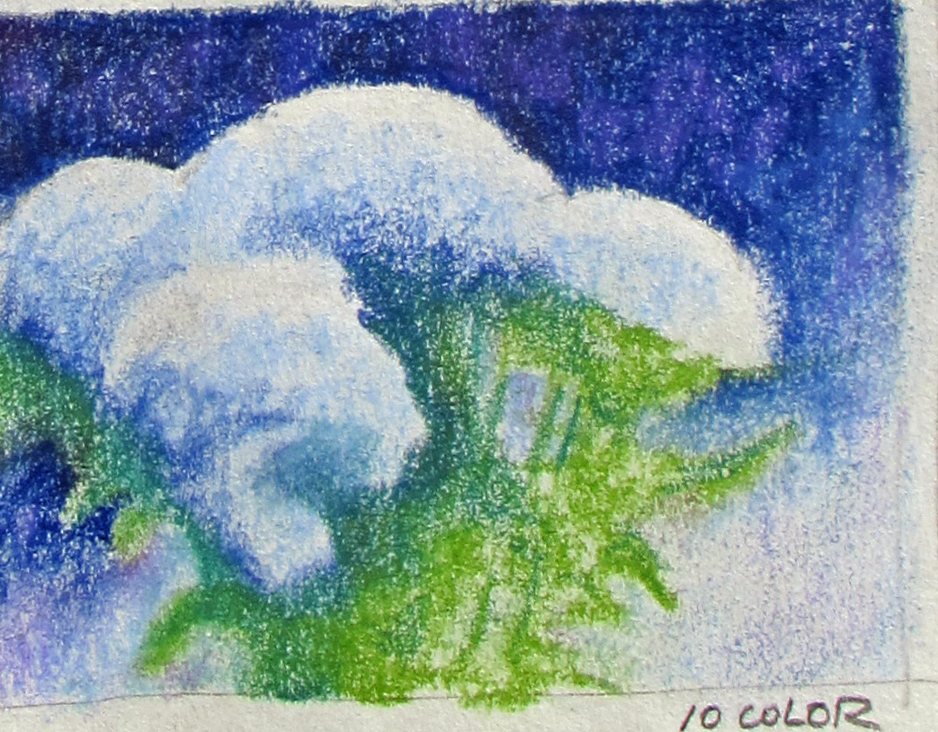
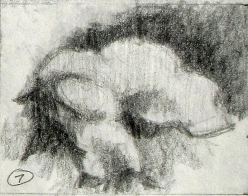
After looking at all the tonal and color studies I was attracted to two of them – tonal study 3 (color study 2) and tonal study 7 (color study 7). The former was clean and simple, more botanical, while the latter was more complex and floral (if you can feel the difference). In the end I decided I would do a vignette, corresponding to tonal study 3 and color study 2 because I wanted to keep it more as a botanical painting. The background would be clean.
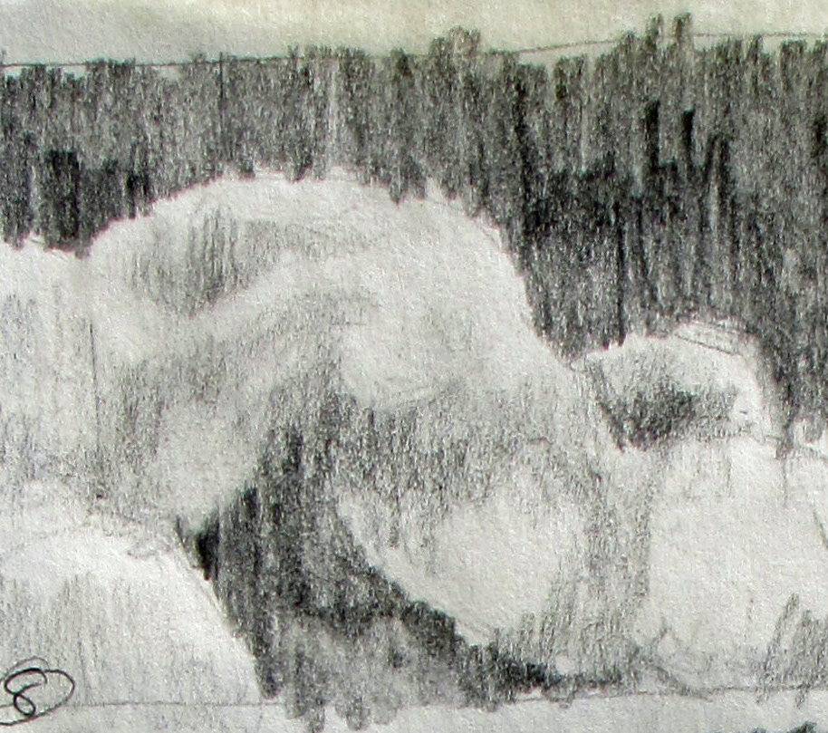
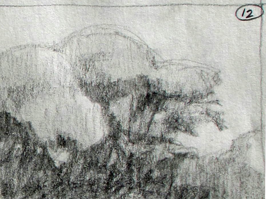
To be sure of my choice I did a quick but a bit more detailed pencil study of tonal study 3. I liked the composition and shapes and felt it would make a good painting.
Color study 7, with the dark background extending into and filling the upper right corner is also a promising composition and I may do that one at some future date.
I’ll start on the full size pencil drawing next.