Work In Progress: Louisiana Iris, Update 3
After completing the leftmost standard (petal), I completed the smaller petal in front of it. It is very light in color and required much less work. As with the previous petal, I started with lavender and defined the contours, creases and shadows, applying a bit more pressure in the darker areas. I then went over the lavender with lilac to complete it.

The second standard, just to the right is a little more complex, with more value and color variation. But it, too, can be tackled in the same manner. Light to dark. I started on the inside of the petal, laying down a layer of lavender over the entire interior, pressing a bit more heavily in the darker areas, to get in the creases, puckers and shadows. I decreased the pressure on the pencil going down into the throat. Next, a layer of hot pink was layed down in the center of the petal, feathering it out to either side. I put a bit more pressure in the creases just to the right and left of the midrib. Lilac was added next, into the creases and into the shadowed area of the overlying curved portion of the outside of the petal. The center of the standard has much more red, so I put that in with mulberry, feathering it out to the right and left. The area in shadow required some mulberry as well, and just a bit of violet.
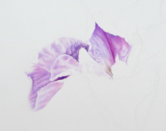
After laying down the basic colors and tones for the interior of the standard, I went over the area again with lavender, lilac and mulberry to darken the colors and tone. Finally, I added a little canary yellow and lilac to the lowest, left side at the base of the petal going down into the throat.
The outside of the standard was started with lavender again, first with outlining, then filling in, going heavier in the creases and shadowed areas.
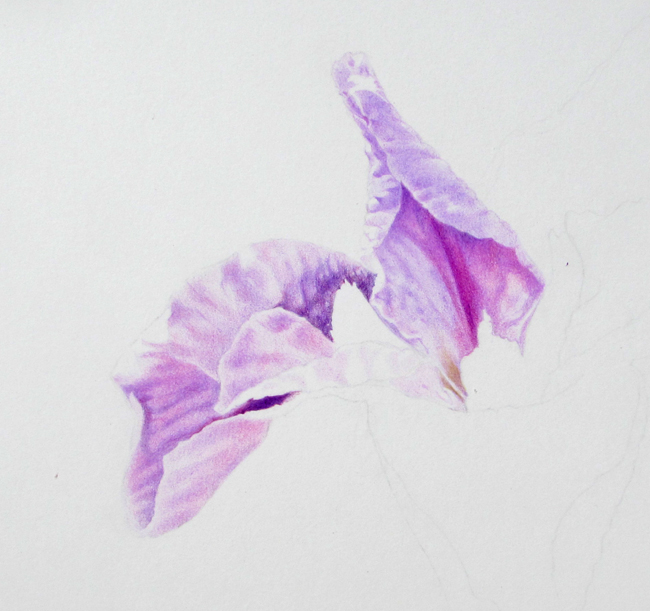
The next standard to the right, pointing to about one o’clock was next. This one has more intense color and darker values but can be tackled in the same manner. Lavender was used first to cover the entire interior of the petal, then I went a bit heavier to define the midrib area and the creases radiating outward. There’s a bit more pink color to the interior of this petal, so I added a light layer of hot pink in the central third of the petal, letting it bleed out toward the sides. Mulberry was added next, over the hot pink in the center third, with heavier pressure along the midrib. I bled out the mulberry to the sides also, but not as far as I did with the hot pink, so the hot pink still showed up outside the mulberry.
Lilac was added to the right and left sides of the midrib, defining the shadows of the creases radiating outward and indicating the shadows created by the curving edges of the petal. More lavender then lilac again was used to fill in the petal. To get the central rib of the petal darker I used violet. Violet was also used just to the right and left, easing into the mulberry. I then went back over with lavender, lilac, mulberry and violet where necessary, to tweak and adjust the colors and values. The central area seemed to have a yellow glow, maybe from sunlight in the back, so I added just enough canary yellow to produce that bit of glow. The outside was completed with lavender and lilac in light layers. You’ll notice I kept a light edge to define them better.
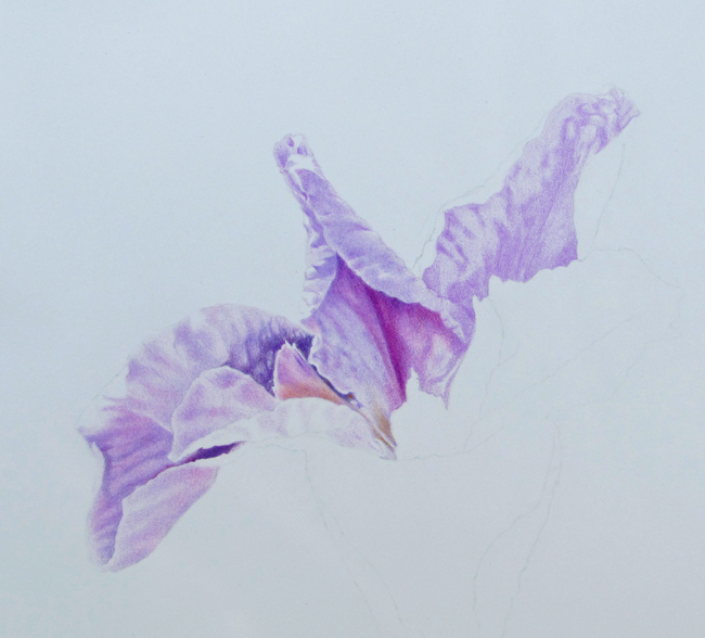
On either side of the standard that points to eleven o’clock there are two small structures. The one on the left is triangular in shape, the one the right more elongated. Both are similar in color. Lavender was used as base color, going a bit darker for the shadows. Just a hint of hot pink added as well. The structure on the right is darker behind the petal in front, so I added some mulberry and violet to the darkest area on top. The bases of each lose the violets to some degree, with more yellow appearing. The bases of each structure take on a grayish cast, especially in their shadows. That slight gray color was produced by using canary yellow and its complement, violet.
The style (the triangular structure in the center) and the signal (the upside down triangular structure below it) were done next. The top of the style is lavender and hot pink. A bit of violet under the edge indicates shadowing. The three gray patches on the lower part of the style were again produced by mixing the complements yellow and violet. Some yellow bleeds out around the edges. The signal on the bottom petal (the fall) is thought to be a landing strip of sorts for pollinators and so is colored brightly to beckon the insect. Canary yellow and a bit of violet is all that was needed to define it.
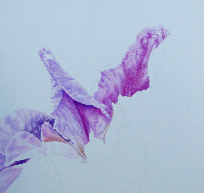
The bottom fall (the petal on the bottom) was completed next. It is very similar to the upper one and was finished in the same manner. Lavender was used first to give a base color and then to define all the creases, folds and ribs. Lilac was used to further deepen the values and shadows. I then added mulberry in the center, using a line stroke to color in the four ribs running downward from the signal. Violet was added to darken the central area further. I purposely left the mulberry color in the ribs and darkened around them. The right side of the petal seemed to be more pink, so I added a light layer of hot pink to that side. The left side was left with the lavender-lilac color. Now that the basic colors were down, I just continued back and forth with lilac, lavender, mulberry and violet to deepen the colors and tones and maintain the shadows, folds and creases. I used care to work the darker colors up into the signal to make it stand out, just as nature intended.
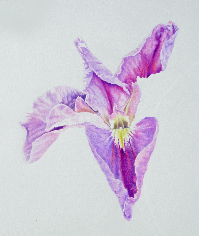
The outside of the petal required lavender and lilac on both sides, with a light layer of hot pink on the right, to continue the pink cast noted on the inside. That same pink was carried around onto the curved outer part. Once again, I left the edges more white to define them.
The last standard on the right was completed with mostly lavender and lilac, once again. The darker creases on the inside required some violet and just a hint of mulberry. The creases on the bottom part are deep and colored in with lilac, a bit of violet and hint of hot pink.

The Iris was completed in a little more than 17 hours. That’s a little more than the 12 hours of class time, and more than I would have liked for the intermediate level class, but within the range of capability of intermediate level students if they put a bit of time in on it at home in between classes. There is some detail in this flower but not too much. The number of colors used is minimal. By tackling one petal at a time, and using the same procedure for each, the coloring can be simplified. There are only a few layers of color laid down to accomplish this painting. It serves well as a next step toward more complex colored pencil paintings.