Work In Progress: Louisiana Iris, Update 1
This summer I’m teaching a number of classes in colored pencil technique at On Top Of The World, a community in Ocala, Florida. The classes are part of an adult education program called Master the Possibilities that features hundreds of classes on a myriad of subjects such as the arts, politics, health, finance and history. I’m proud to be a part of this exceptional program that imparts a wealth of knowledge to individuals eager to never stop learning. I will be teaching introductory classes as well as more advanced classes on colored pencil painting.
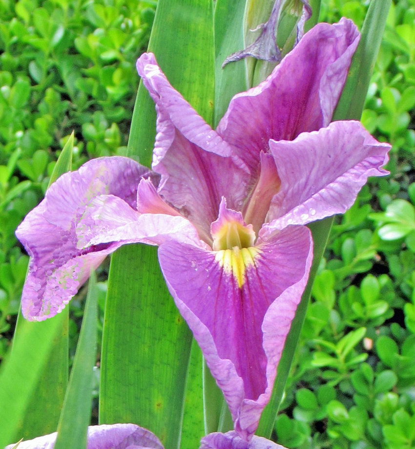
One of the classes I will be leading this summer involves the painting of an Iris – a Louisiana Iris to be exact – in colored pencil. It is a plant that I grow in my garden at home. I felt that it was not only a good subject for a painting but would be wonderful vehicle for teaching more advanced classes in the medium of colored pencil. The number of colors involved is not very large, there’s some complexity, but it can be broken down into nice bite size pieces, the basic techniques I’ve been teaching in my introductory classes can be used to complete it. Any students who are taking the class can get some fore-knowledge of the project, and anyone who might be interested in taking the class can get an idea of what we’ll be doing. So, for the next few weeks I’ll be taking you through the development of a colored pencil painting of a beautiful flower.
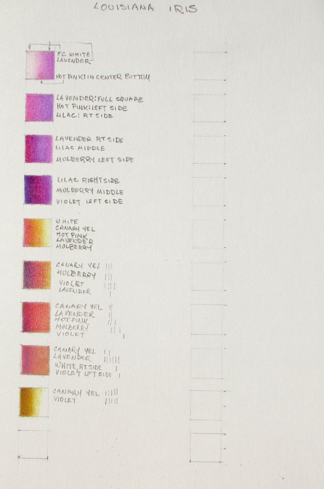
After settling on the subject, the first step in the process is figuring out the colored pencils to use. Even though there’s a variety of values from nearly white to deeply dark, the colors are all in the violet group. As I look over the flower, looking at all those values, I look through my colored pencils to find ones that will match the colors I see or pencils that, combined, will yield the colors I see. I will be using Prismacolor Premier colored pencils for this project. The ones I pick out are all in the violet – lavender spectrum: lavender, hot pink, lilac, mulberry, violet. I add white because I’ll be using that in the lightest areas, helping to blend in the colors. Near the throat of the iris, on the lower falls, and the style just behind it, is yellow, and yellow is also evident as a yellowish glow on the inner parts of the petals near the throat. For the yellow I choose canary yellow. The yellow on the falls and especially on the style gets dark, a grayish yellow, which I think can be produced by using yellow and its complement, violet.
With these choices of colors as a start, my next step is to reproduce all the colors and values in the flower. I might have to add more, or remove some, but I start with these. It’s best to work out all the colors and values prior to painting the flower because guessing as I go can lead to mistakes that can’t be corrected. Wasting paper and time is costly. On a separate sheet of paper I draw a lot of squares. Then, after I pick an area of the flower I want to reproduce, I choose some pencils that, combined, I think will reproduce the color and value I want. For instance, the leftmost petal has a rich variety of colors, probably most of the ones found in the flower generally. For the lightest area, I choose white and lavender and fill in the first square. Since there are transition areas in the flower, going from near white to near lavender, I blend it that way in the square to see if it matches. In other areas there’s more lilac in the mix. In others, I can see some pink. So, I work out squares with these combinations to see if they match. I’m careful to record my colors and their placement. The darker areas run into the mulberry and violet.
In this manner I continue to fill in squares with different combinations of pencils to match what I see. Some combinations don’t work out, others do. But in this manner I’m able to eventually arrive at combinations that will reproduce the flower – even the areas suffused with yellow, as well as the yellow in the throat. As I suspected, a combination of violet and yellow gave me the dirty yellow needed for deep in the throat. There are always unexpected turns that I didn’t see in the beginning, but working out as much as possible before hand eliminates most surprises and makes for a much easier experience.
The colors used for this project are white, lavender, lilac, mulberry, violet and canary yellow. I’ll be doing this painting on Stonehenge paper. Next week we’ll get started coloring it in.